

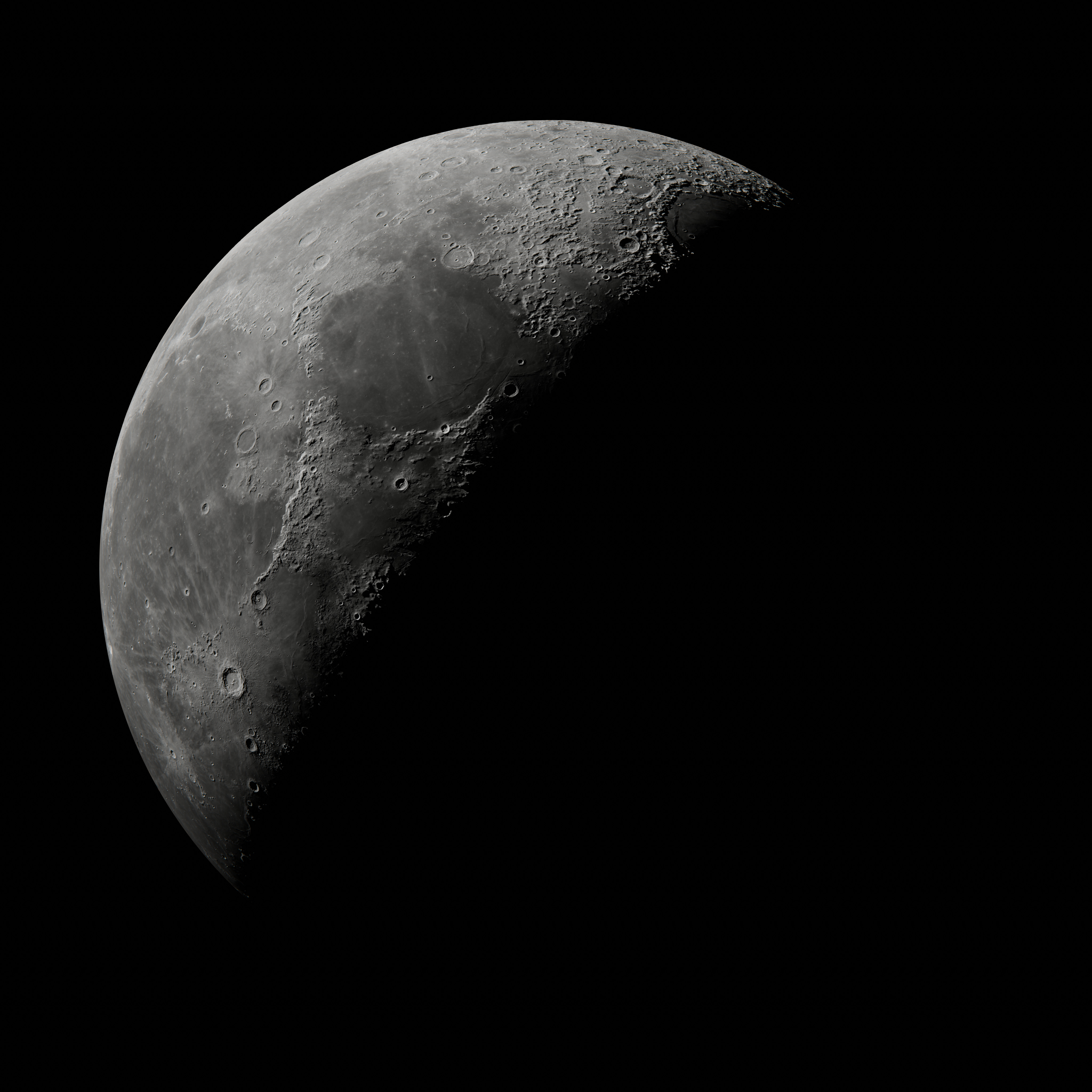
![Moon render by me with ultra high surface detail. [4K]](https://lemmy.world/pictrs/image/c9a7e92b-8c2b-4574-99a6-b6da80db0f94.png)
Test render from a very simple blender animation i am working on as early blender learning project.
Feel free to use as you please. Textures courtesy NASA’s Scientific Visualization Studio
Render and texture edits by me, made with Blender.
I’m always impressed by the craters, and think to myself how large or fast the asteroids must have been travelling
Yes, and no atmosphere to slow them down.
How did you UV the poles?
Didnt do anything specific in that regard, its a just a standard UV sphere with a (2:1) texture map. I did run in to that issue when trying to export (bake) a procedural gas planet texture map, but its pretty trivial to fix the texture map in photoshop afterwards. This is just an entry level project i did to learn the basics of blender, after 25 years of using 3DsMax only. Took a good while to render on my new pc so i thought i should share it before deleting it localy.
This is my recreation of your picture. Your bumps appear more detailed than mine. Did you add noise to it, or are your bumps just stronger than mine?
Ooh nice, i may have used a higher res texture, or could be more subdivisions, this is very close though!
I made this model a while ago with the same NASA data. I have no clue where you get the extra bumps in the flat regions from, because I also used the 1GB height map. But I think my bump strength is accurate, because it matches my references.
So i looked in the blend file, and it seems i changed the texture map to this one at some point: https://wms.lroc.asu.edu/lroc/view_rdr_product/WAC_GLD100_E000N1800_064P
That one was better, and i also recall manually aligning the color map from the other Nasa site i linked before, just used photoshop offset the color map horizontally, sorry i was learning alot and didnt yet have a proper folder structure going, its also likely i made othe changes to the textures but i was moving fast and eager to get back to blender, i could likely send you the blend file along with those texures though, if you let me know an easy way to share it.
Using a different height texture explains the different results. Odd, that the Arizona State University has more bumps than NASA at the same 64ppd resolution. Do you think they added noise to the NASA data? When I add noise to the height map in Blender, I can make it look like this.
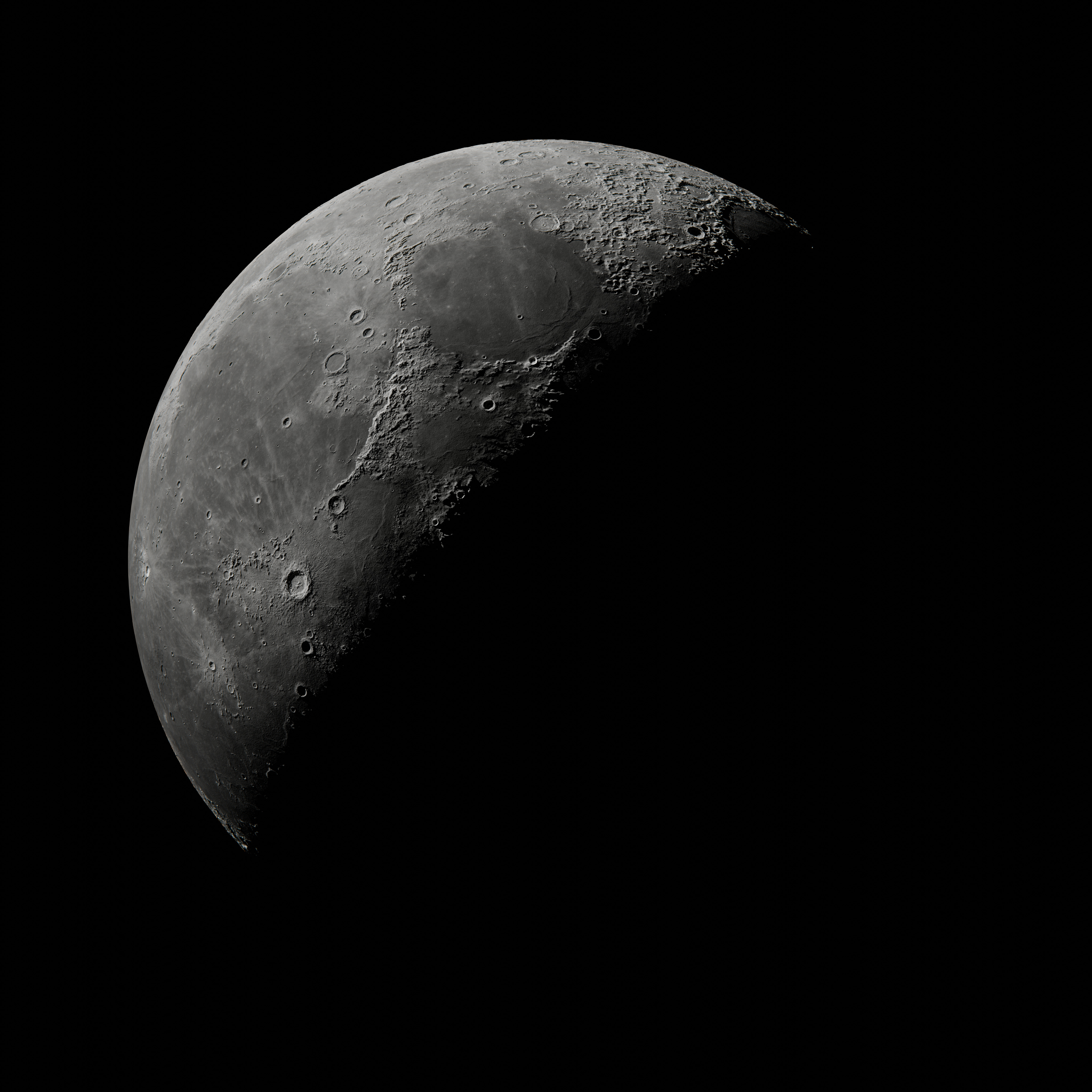
Its possible, but its more likely processing the raw data using a different technique that causes the differences. Cant be sure, but yeah this looks alot better now. I didnt add any noise myself, since i dont know how to/hadnt considered it, when i felt it looked a little flat i just went looking for a better topo map.
deleted by creator