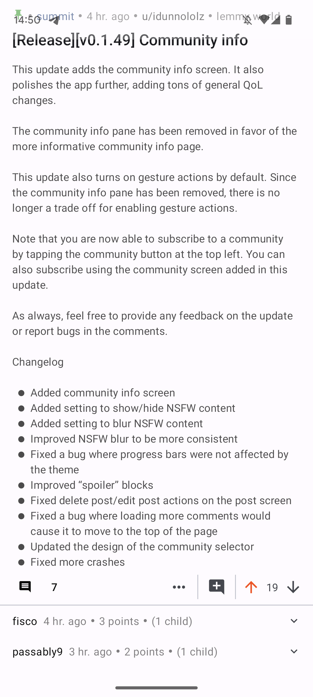
This update adds the community info screen. It also polishes the app further, adding tons of general QoL changes.
The community info pane has been removed in favor of the more informative community info page.
This update also turns on gesture actions by default. Since the community info pane has been removed, there is no longer a trade off for enabling gesture actions.
Note that you are now able to subscribe to a community by tapping the community button at the top left. You can also subscribe using the community screen added in this update.
As always, feel free to provide any feedback on the update or report bugs in the comments.
Changelog
- Added community info screen
- Added setting to show/hide NSFW content
- Added setting to blur NSFW content
- Improved NSFW blur to be more consistent
- Fixed a bug where progress bars were not affected by the theme
- Improved “spoiler” blocks
- Fixed delete post/edit post actions on the post screen
- Fixed a bug where loading more comments would cause it to move to the top of the page
- Updated the design of the community selector
- Fixed more crashes
I’m on version 1.48, & noticed the scrollbar still isn’t following the accent colour, it’s still orange…not a biggy of course…Cheers👍🏻
Thank you for reporting this. I’ll fix it for the next update.
Thank you for all the updates, & all you’re doing 👍🏼. Another thing I have noticed, as has been mentioned in another comment,. I use the app in omoled mode, and the text contrast, or whiteness is on point in Card view, however in compact and list, this is heavily reduced to grey… wondering if this was deliberate? Thanks again…
Hi. Thanks for this update.
I wanted to use the classic comment style because the continuous line through all comments but noticed is bugged. I’m using indent 5.
Would be sweet with colorful lines that is continuous too
Yes, definitely.
I came across this app from a humblebrag post on one of the android communities where someone was asking about battery optimization.
I must admit this app is slick and is jockeying for the top spot in my Lemmy app preferences.
I do have a tiiiiny request for post views though. Specifically the option to have the image at the end.
My preferred layout would effectively be image in the middle. That is, the post title at the top, then the image/media, and the comment/upvote indicators at the bottom. Would it be possible to implement this? It’s a very minor annoyance but keeps tripping me up.
Relevant part of the settings:
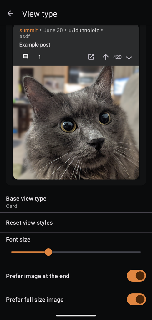
Coincidentally someone actually requested this yesterday. I’m planning on implementing this for the next update.
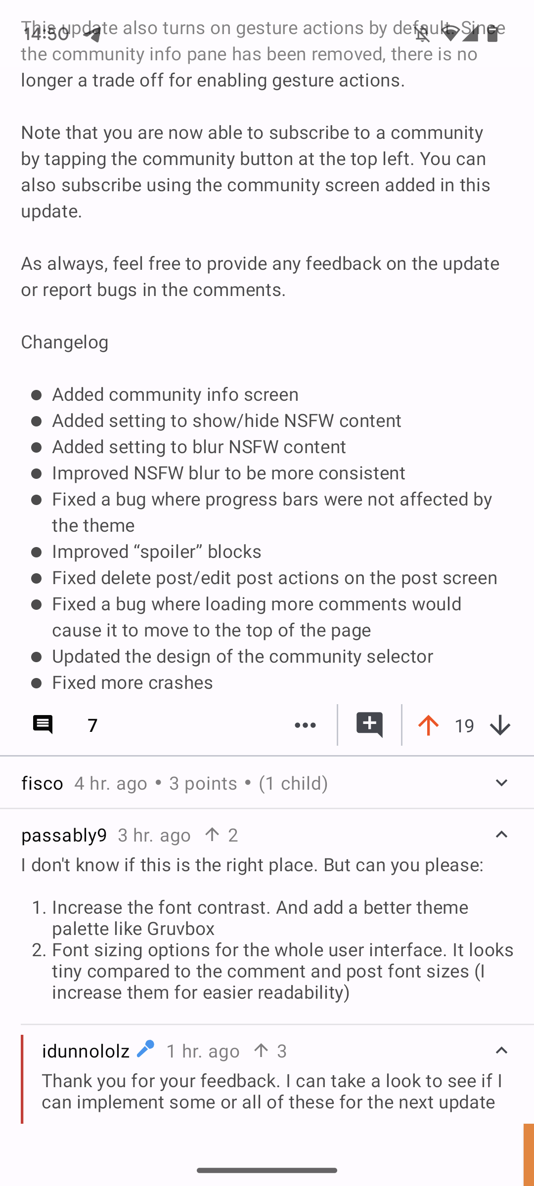
I don’t know if this is the right place. But can you please:
- Increase the font contrast. And add a better theme palette like Gruvbox
- Font sizing options for the whole user interface. It looks tiny compared to the comment and post font sizes (I increase them for easier readability)
Thank you for your feedback. I can take a look to see if I can implement some or all of these for the next update
FYI the ‘classic’ comment thread setting doesn’t respect changes to the indentation setting.
Thank you for reporting this. I’ll fix this in the next update.
I noticed top level comment divider lines disappear when all child comments are collapsed
Small UI thing, maybe it’s intentional
Other than that, the newest update is fantastic. With tap-to-collapse comments, Summit now has exactly the navigation system that I wanted. Thanks!
That looks like a bug. I’ll look into it for the next update. Thanks for reporting!
First, I just want to thank you for making this app work on android 7.
Just wanted to ask about this though. “no your limits”? No limits? Know your limits? Is this an intentional play on words?
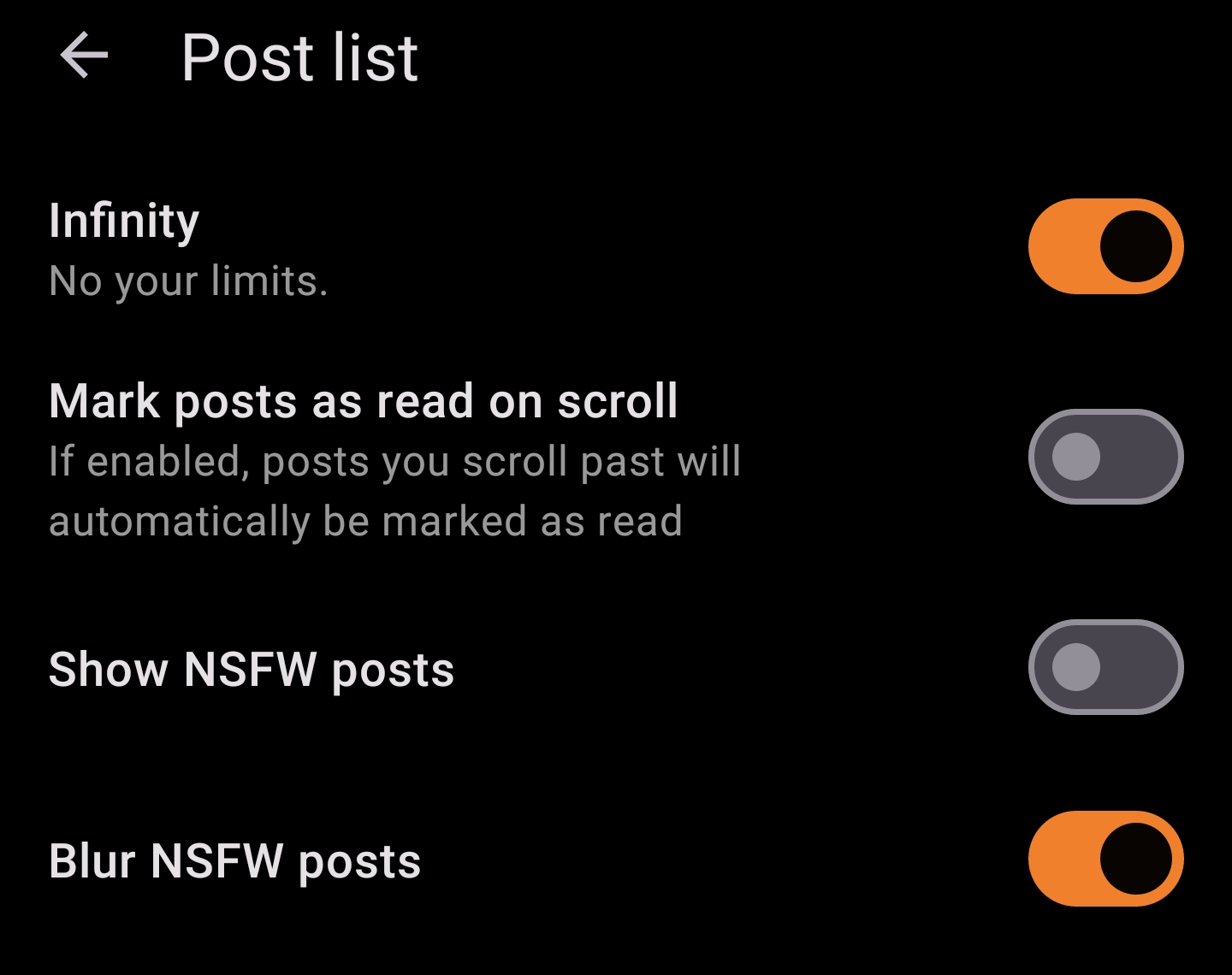
It is :D. Get it? No your limits = infinity :D
If you have blur nsfw posts set to show they are still blurred in the saved section. Same with user profiles.
Thank you for reporting this. I’ll fix this in the next update.