
- cross-posted to:
- maps@hexbear.net
- cross-posted to:
- maps@hexbear.net
cross-posted from: https://lemmygrad.ml/post/4288517
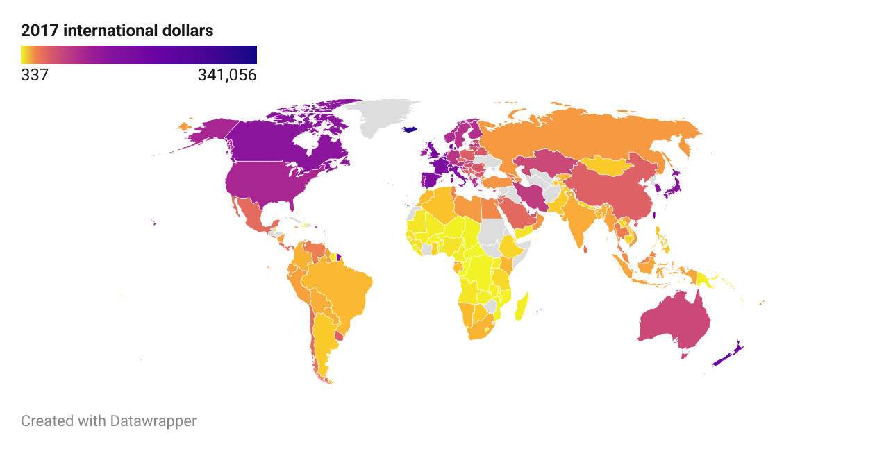
I remember this post that compared the quality of life in the DPRK and the US. There are many ways in which traditional stats like the GDP per capita exhibit bias in favor of some countries; countries may differ in their…
- …distribution of wealth.
- …basic expenses.
- …cost of products and services.
So, I decided to give it a shot. I started from median wealth per adult values published by UBS (data from 2022); my logic was that two people who end up, no matter their income, with the same amount of expendable income will acquire a similar amount of value in the form of equities, real estate, vehicles… By using the median value, I make sure that wealth in countries with high inequality isn’t overestimated.
Then, I multiplied these values by the ratio between adjusted (international dollars at 2017 prices PPP) and unadjusted GDP per capita of each country, using data from 2022 by the IMF.
There are some interesting things to note within the map. Enjoy!
Fantastic work. When I get a minute I might even download the data and poke at it myself.
Does this take into account basic services that are offered subsidized or for free? I remember one of the most interesting things from that other post was that someone in the DPRK basically got all of their income as expendable income. Whereas in the US, you had to blow 80% of it on basic services like food and rent and medical care.
Indeed! If one person ends up spending most of their income on basic needs, they’ll not be able to spend much of it on long-lasting properties, which is what this map measures. It’s a pity though that Cuba and the DPRK did not appear in the sources, but at least we do get some interesting perspectives on the countries that do (look at Venezuela!).
Gotcha, thank you!