

I appreciate the graphics that they post, but this one was… Bad.
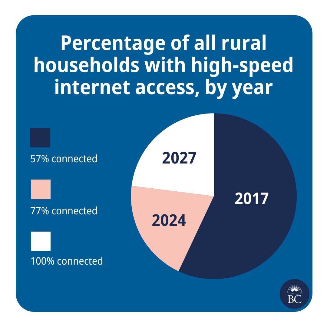
This is great news! And please also extend my deepest sympathies to whichever analyst was asked to cram this histogram into a pie chart.
They are taking the criticism in good faith though
Well, we’re taking a pie in the face on this one @[…]
We try to make info like this as clear as we can, @[…], but we don’t always get it right. Thanks for your feedback. We’re, uh, cutting ourselves a slice of humble pie.
The post: https://www.instagram.com/p/C7Pi4qAh72c/
A line plot is a much better choice here as the time intervals between the data points seems important.
It’s suspicious that an entire dimension is not depicted visually.
The reader is forced to calculate the time spans and the implied rate of changes in the two intervals.
The chart doesn’t actually use the space on the page to show anything more than text would; it is a waste of space.
They could easily have presented the data in a line graph to show more and make the reader do less.
You’d think that would be reasonable, but you forgot the critical component: Pie charts are simple, line charts look like maths, Important People like looking at pictures they pretend to understand*. So you gotta have a picture, but it has to be simple, so a pie chart it is.
The content or informative value doesn’t matter as much because the person trying to present it doesn’t actually care about the information. They’re just there to sell good news, using some pretty numbers and pictures to support their point so it doesn’t look made up.
Source: A data analyst way too cynical for how recently I started working in the field.
*until they’re trying to present it to people that have the audacity to ask actual questions and they suddenly pull me into a telco to explain what they’re seeing, then interrupt me mid-explanation with a half-assed understanding of it and put me in a bind between correcting them or just letting them work on false assumptions