
- cross-posted to:
- main@0xdd.org.ru
- artdesign@jlai.lu
- fediverse@lemmy.world
- cross-posted to:
- main@0xdd.org.ru
- artdesign@jlai.lu
- fediverse@lemmy.world
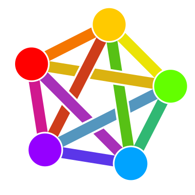
We propose the symbol ⁂ to represent the fediverse.
We propose the symbol ⁂ to represent the fediverse.
This logo is really unpopular hence why there is always so much talk of making something cleaner and more professional.
…and this latest proposal certainly isn’t either of those things.
Source? I’ve only ever seen a handful of strawman arguments that “I’m not offended by the vague resemblance to a pentagram/use of rainbow colours implying LGBTQ+ support, but somebody might be”, but its fairly wide adoption suggests that most people — myself included — actually like it.
This is the first I’m hearing of any issue with it resembling a pentagram, the criticisms I’ve heard involve the design in general not looking professional, not scaling well, and lacking a unique palette.