- cross-posted to:
- samsung@zerobytes.monster
- cross-posted to:
- samsung@zerobytes.monster
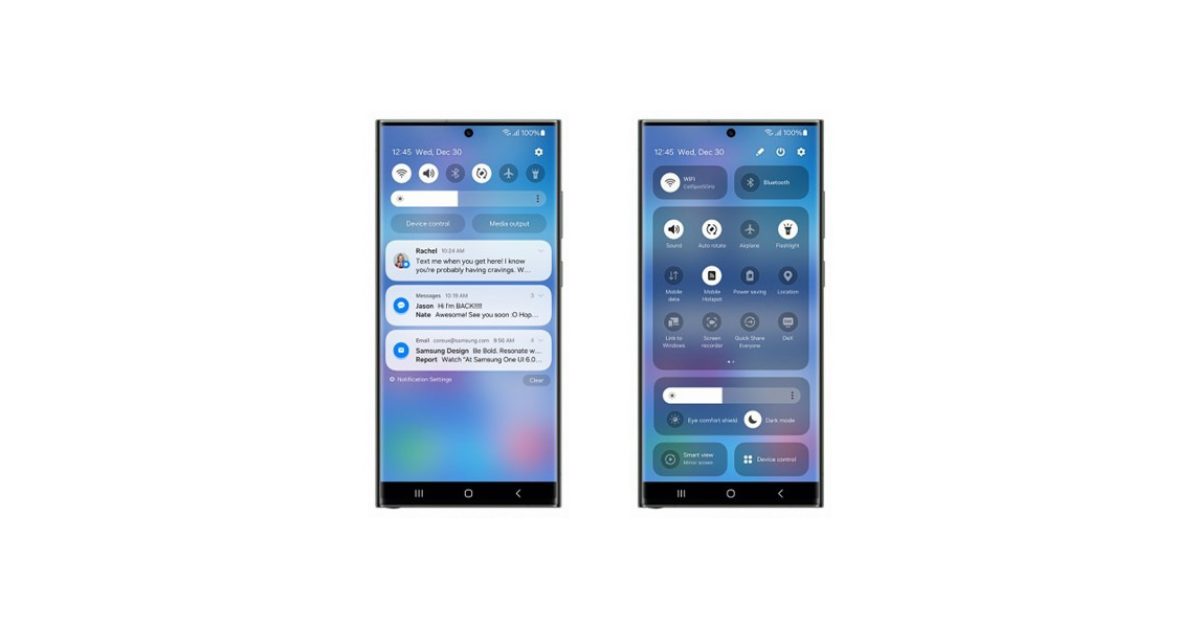
It seems like OneUI 6 is coming soon. However with the screenshots of the control centre UI, it seems like the ‘one handed’ UI focus is disappearing as more UI elements are brought higher…


Tbf this looks extremely close to Samsung’s layout but with an added widget and long buttons which are like Google’s, which I think waste space.