- cross-posted to:
- samsung@zerobytes.monster
- cross-posted to:
- samsung@zerobytes.monster
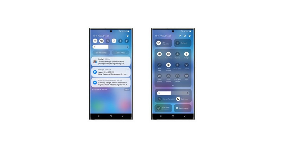
It seems like OneUI 6 is coming soon. However with the screenshots of the control centre UI, it seems like the ‘one handed’ UI focus is disappearing as more UI elements are brought higher…


Hmm. What you’ve posted isn’t far off Samsung’s shade, except for some weirdly wide buttons at the top and a media controller that doesn’t add anything to the experience.
Yes it’s got minor but not insignificant aesthetic differences, but to say Samsung’s is awful and then hold this up as an example of good design… 🤔
Here’s my Samsung’s shade in its two positions (which can be changed to open fully on the first swipe if preferred).
You can just remove those device and media control buttons from the quick panel layout.
I was referring to the weirdly wide buttons on his shade, not mine. :)
Samsung’s quick settings is okay, I should’ve clarified. I just think the rest of their UI sucks ass