This is an encounter builder a friend of my and me developed as one of their pet projects.
Check it out if you are looking for some tools.
Also it’s open source, if you want to contribute and make it better.
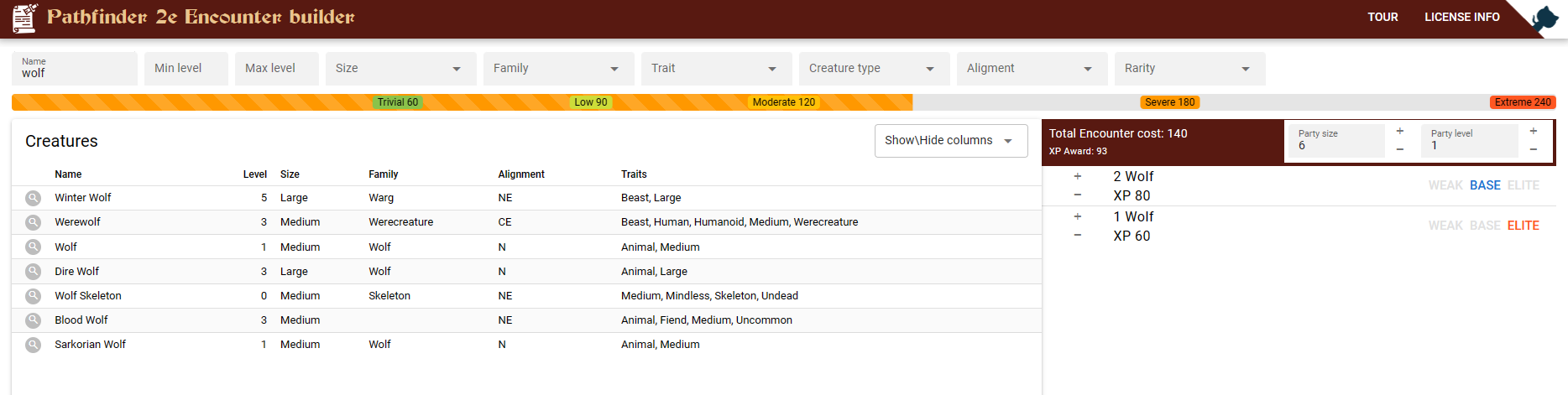
I’ve recently been spending a whole bunch of time researching and playing around with different encounter building tools. Yours is one that I really liked. I liked how it shows both the encounter cost and the XP award (some others show only one of those, or the other, but not both).
I also really liked how it shows difficulty of the encounter as a scale, rather than just declaring “this is moderate” or “this is severe”. That was particularly annoying because it seems like there’s an inconsistency with how other sites decide which category it fits into. Most sites seemed to think that 81 XP makes a severe encounter, because 80 XP is the limit for a medium encounter. Some said 80 XP is where a medium encounter starts and all the way up to 119 is medium. Intuitively I feel like the latter is how it should work, but most seem to disagree. By displaying it on a sliding visual scale like you do, you sidestep the problem and allow me to come to my own conclusion.
Personally I’m not likely to actually use it all that much, purely because the Pathbuilder encounter builder also lets me save and come back to multiple different encounters while I’m planning out a campaign. Even better, it includes initiative tracking with optional integration to players’ character sheets. For purely encounter building, yours is a much nicer user experience, but Pathbuilder fits into a whole ecosystem a bit more nicely.
Very cool! I think this will be useful.
One suggestion: the party size and party level fields kinda get lost in the monster filters. I suggest putting those two up to, with some visual separation between them and the filters.
Note that I was viewing on an iPhone, so small mobile UI. There might be better visual separation on a computer.
But this is super cool, and I’ll be checking out the source code later.
One suggestion: the party size and party level fields kinda get lost in the monster filters. I suggest putting those two up to, with some visual separation between them and the filters.
I agree. I reckon moving them next to the encounter cost would work well.
Additionally, being able to just click up and down would be so much nicer than needing to select and type the number out by hand. Example mock-up:
This is a great suggestion. We are still working on the ux, will try to implement it next time I work on the project.
We also need to improve mobile usability, right now it’s not the best…
This looks excellent, I’m excited to try it out. I’m about to switch my game from Age of Ashes to homebrew and I’m going to have only 2 players so this will come in handy.
I love your tool, it just gets a bit silly when placing a creature 4 levels above the party. The bar stays on Extreme instead of going black like if you add several of a weaker mob. It caused me some confusion on the first ten minutes or so when putting a creature 5 levels above and slapping the Weak template on it.

