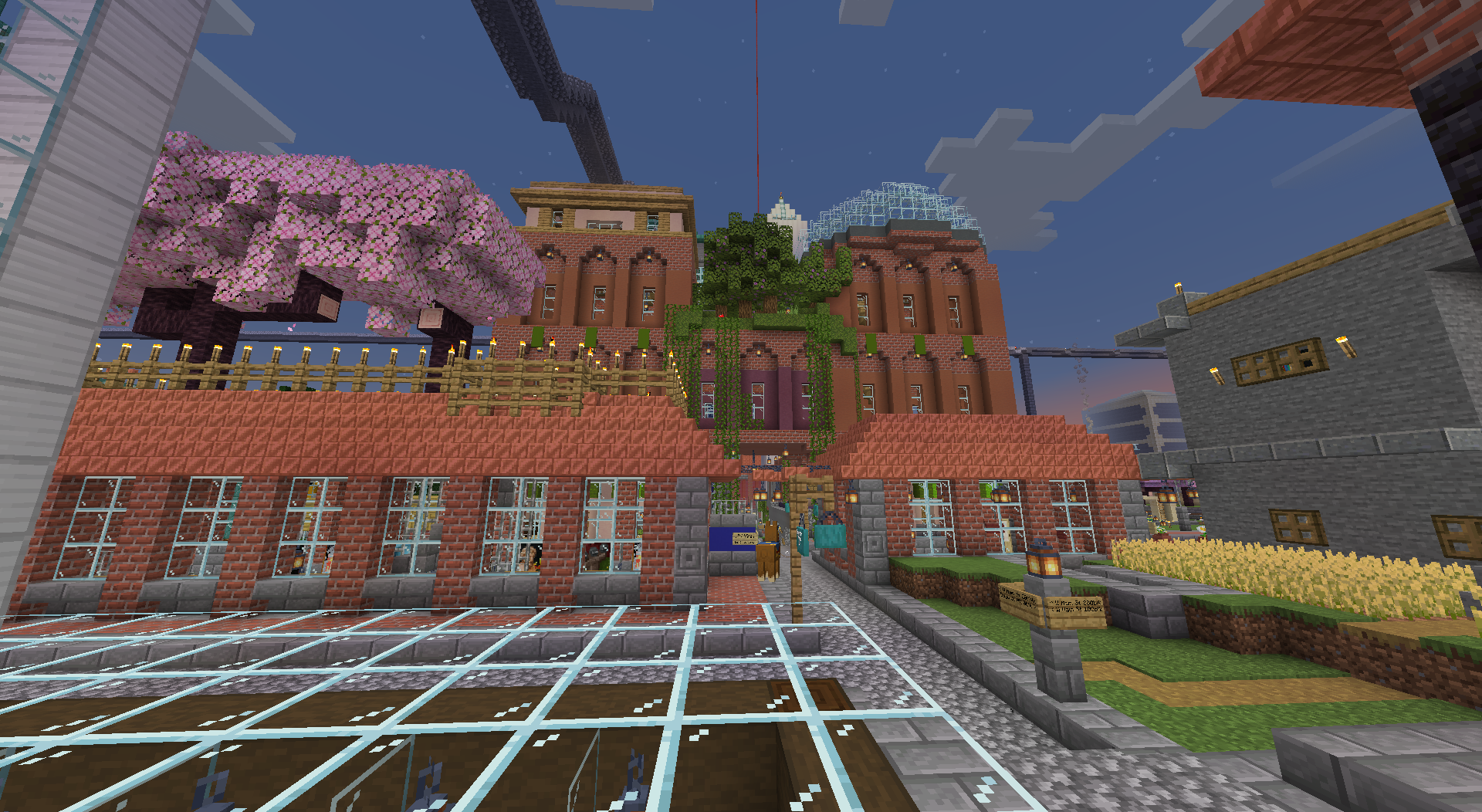
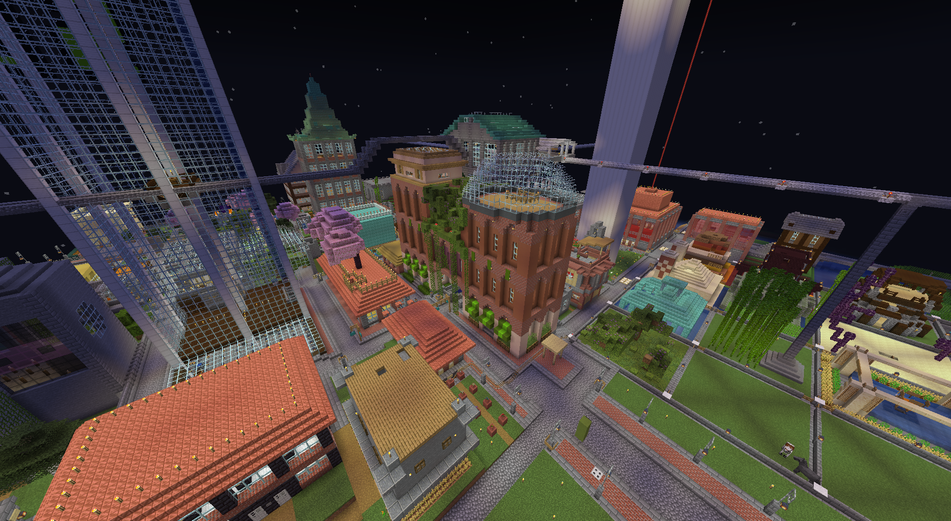
I felt that the asymmetry of the first extension (the purple part with green roof in the middle) was a bit too jarring and the support for that structure was questionable looking, so i added another section to even it all out and put an observatory dome on the top so that it didn’t look too symmetrical.


Wow that’s very nice, I like the glass dome on the top, though if I were building it I would’ve personally used white or light grey glass as it has a much less noticeable outline. Still looks great though.