

I appreciate the graphics that they post, but this one was… Bad.
This is great news! And please also extend my deepest sympathies to whichever analyst was asked to cram this histogram into a pie chart.
They are taking the criticism in good faith though
Well, we’re taking a pie in the face on this one @[…]
We try to make info like this as clear as we can, @[…], but we don’t always get it right. Thanks for your feedback. We’re, uh, cutting ourselves a slice of humble pie.
The post: https://www.instagram.com/p/C7Pi4qAh72c/
You must log in or register to comment.
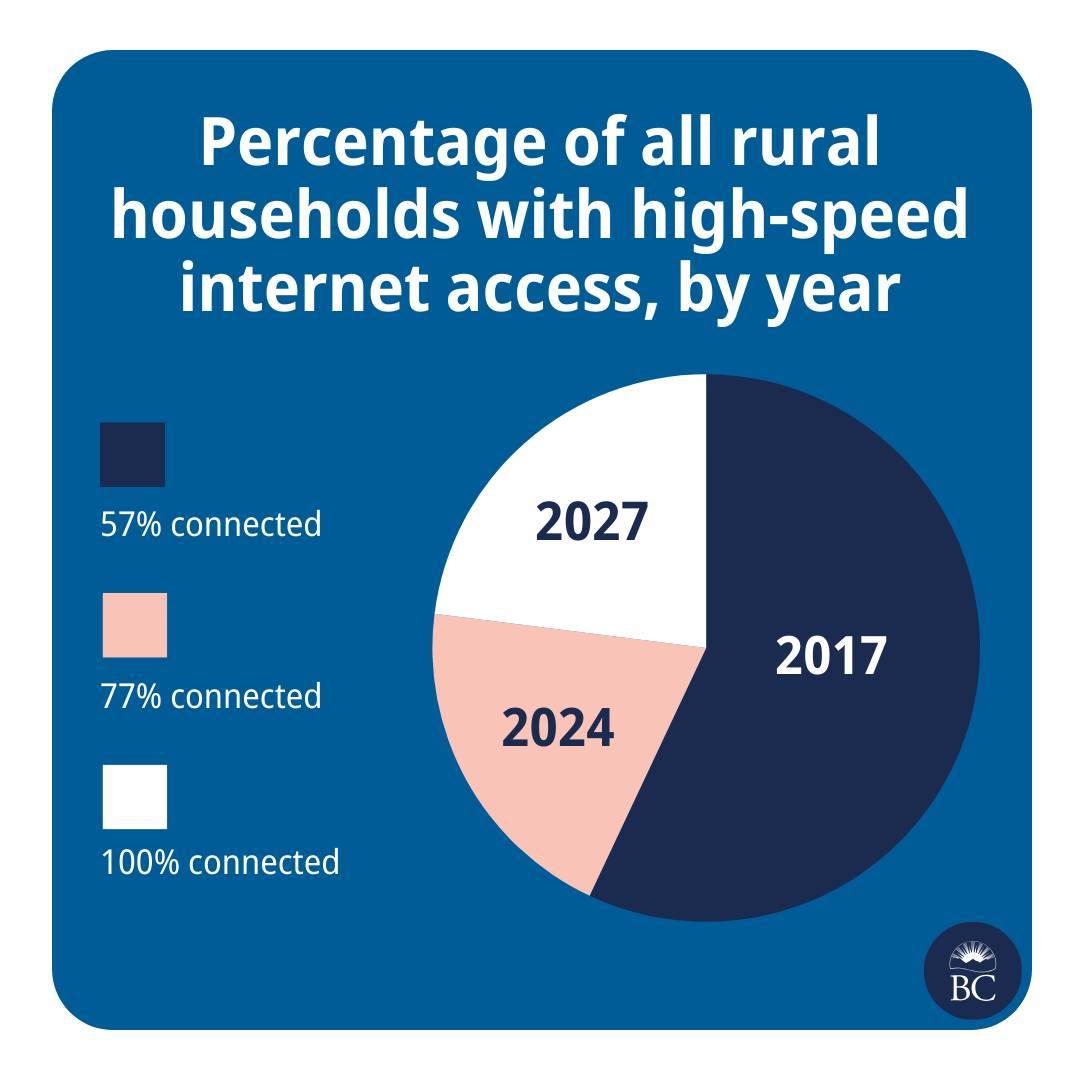
In 2017 57% of rural households were connected. In 2024 the next 20% are being connected. In 2027 the final 23% will be. It’s not how I’d use a pie chart but it’s valid.
A line plot is a much better choice here as the time intervals between the data points seems important.
It’s suspicious that an entire dimension is not depicted visually.
The reader is forced to calculate the time spans and the implied rate of changes in the two intervals.The chart doesn’t actually use the space on the page to show anything more than text would; it is a waste of space.
They could easily have presented the data in a line graph to show more and make the reader do less.You’d think that would be reasonable, but you forgot the critical component: Pie charts are simple, line charts look like maths, Important People like looking at pictures they pretend to understand*. So you gotta have a picture, but it has to be simple, so a pie chart it is.
The content or informative value doesn’t matter as much because the person trying to present it doesn’t actually care about the information. They’re just there to sell good news, using some pretty numbers and pictures to support their point so it doesn’t look made up.
Source: A data analyst way too cynical for how recently I started working in the field.
*until they’re trying to present it to people that have the audacity to ask actual questions and they suddenly pull me into a telco to explain what they’re seeing, then interrupt me mid-explanation with a half-assed understanding of it and put me in a bind between correcting them or just letting them work on false assumptions
Sort of valid, in a “when were these households connected, using only 3 data points” kind of way. There’s no graph law, so everything is legal and valid. But this is like printing a book on ticker tape, not impossible, just really dumb.
It’s not valid. Peach is labeled 77% but occupies 20% of the pie.
This chart with these labels is definitely invalid. The dataset it’s based on is coherent, but the labeled pie chart is invalid
Yeah, could show adding the colored blocks together like (color1) + (color2) = 77% connected
“🟦 ➕ 🟧 = 77%”
This is an instance where a 3d pie graph would be better
As a designer, the conversation went like this:
Boss - I need a pie chart to show our goals!
Designer - Cool what are the percentages?
Boss - 57%, 77%, 100%
Designer - Are you sure a pie chart? Not a bar graph or anything else that shows growth?
Boss - I clearly said Pie Chart and I need it done in 15 mins!
Designer to himself - fuck whatever I don’t get paid enough for this shit anyway.
As a data analyst / engineer, I usually go through a similar journey producing those percentages.
Boss: “I need to know when we’ll reach 100% of households having high speed internet.”
Analyst: “Good morning to you too! Who has the data?”
Boss: “I thought you do?”
Analyst: “No, I’m pretty sure I haven’t seen any, uh, internet speed data in our warehouse.”
Boss: “Have you looked in the computer?”
Analyst: “… I’ll talk to Marc, he’s got his contacts with the ISPs, we’ll figure something out. What does high speed mean?”
Boss: blank stare
Analyst: “Right, I’ll talk to the Definitions Department. How should I calculate the forecast? Average over the…”
Boss: “Right, I gotta head to a meeting. You’ve got until tomorrow EoB.”
Analyst: Hectically mashes a dozen different data shapes of historical reports into a unified model, plots the progress so far, curses, tosses some generic trend formula at it because fuck trying to actually figure out the semantics
They invented the progress piechart.
Took me a minute, but it actually isn’t that bad. The size of the last two sections represent the additional % on top of the previous…
Having said that, there must’ve been a better, less confusing way to represent this data
You could easily improve it significantly by labeling the segments:
- up to 2017
- 2017-2024
- 2023-2027
I’ve always said bar or line, especially with time axis. In cases like this, you usually use a line as it usually isn’t linear growth anyway and you’d use a logarithm to predict where it’d be in 2027.
Of course they’re just bullshitting that 100% as real predictions wouldn’t ever get there.
yep line plot for sure.
The years aren’t equally spaced in time, and the future forecast should be clearly differentiated - maybe with a dotted line, or a high to low spread.The graph hides how ambitious it is to more than double the rollout rate.
We should expect to see cost per year (or workforce or some measure of resources) aso more than doubling.Presumably this is a funded a plan, not strictly a forecast, so it’s not unresonable to have accelerating growth, if more resources are going in.
If resources are constant, then yes I’d think diminishing returns wold shape the forecast.
Yea, it’s called a line chart.
Pie charts should never be used, unless you’re trying to show the progress someone is making on a personal pizza.
Even then, a bar chart or stacked bar chart would be preferable.
I used to think that, but I think they do have a place. In an array, pie charts can be a quick way to scan for rough spread on data across different populations. Like, 50 pie charts showing partisanship in the US could quickly show why certain states are “battleground states” and why the rest of the US is already locked up.
Not useful for seeing individual values, or comparing more than 2 numbers (or 3 numbers in a linear axis of comparison), but they’re compact, so they work well for large-volume comparisons.
Actually, in general, they’re fine for comparing two-value data where the intent is to give a sense of scale between the values quickly, but where the actual values don’t matter for the argument. A bar graph puts emphasis on testing the values accurately, but sometimes you just want to show that “it’s about ⅕”, and it doesn’t matter at all if it’s 18% or 22%.
I think the way to go would be to give each slice a different radius, so you could see that they’re layered over one another.
They were really close… just flip the years and the percent, then add an outline/increasing pie radius to make it clear they overlap.
Lol this is hilariously bad though, I can’t even figure out what the pie areas represent. Like, 2017 is about 55-60% of the pie. What fact in that set of data represents about 55-60% of something? It’s like they just dragged the pie slices around until they liked how it looked. You can’t even make graphing software give you that output.
I (somehow) figured it out. Picture it as 3 separate pie charts stacked on top of each other. Or 57% as the base amount and each subsequent area is the increase on the previous amount.
2017 = 57% 2024 = 20% 2027 = 23%
oh shit you got it.
I still don’t think they could have produced this from graphing software, it must have been drawn by hand and w h y
Took me a little bit to find their definition of “high-speed.” You have to look at some PDFs instead of quickly seeing that info. It’s important to note they’re specifically targeting 50/10 Mbps which is actually pretty slow today. In three years it will be even slower. The US only this year bumped their definition up to 100/20 and also suffers horribly from execution.
I think this is a baking recipe?


