

maybe like white on white or green text on green background could be alternate choices. or like an option to only show half the letters. Those would be challenging too. Tho the black text on black background is a start. Maybe like 1/3 of the time needlessly jumble up all the letters too. Anyway, just ideas. the black on black is good enough so far tho for unexpected xtra challenge.

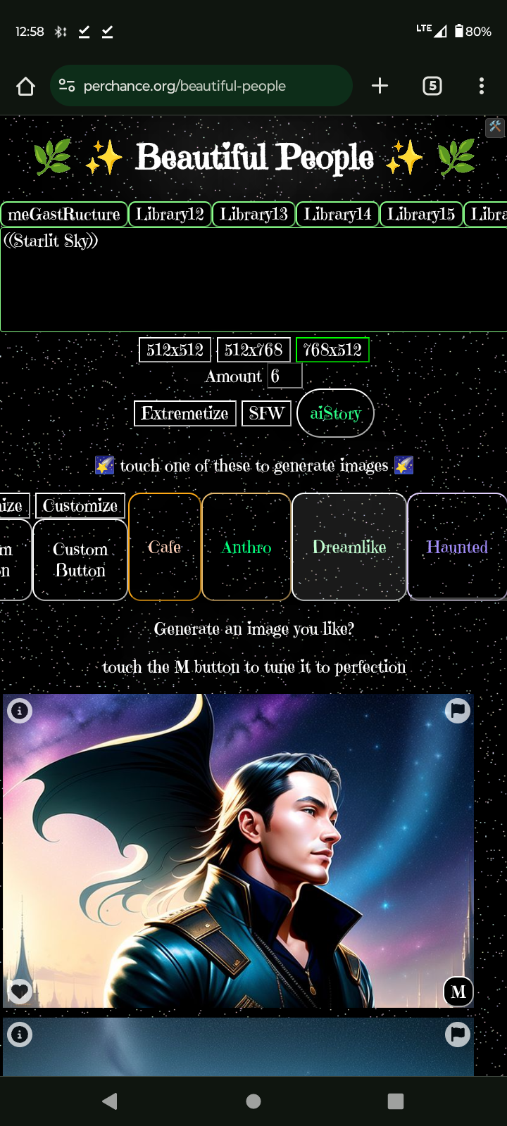











Tho all the stickied things on the generator page are cool, I personally believe a single t2i generator blows them all out of the water because anyone can open up a t2i generator, see how it is written, think “i can do this”, and start their coding journey, from wherever they are, in a fun way. Glad you are making things ‘on our level’ with the same plugins we have access to and as feedback for you and all the experienced devs you would like building things, it’s to get creations in to a t2ilike format so further growth, from and for other people, can happen. Otherwise they are just unrepeatable curiosities. Just my unstoppably honest opinion :) sorry :)