- cross-posted to:
- samsung@zerobytes.monster
- cross-posted to:
- samsung@zerobytes.monster
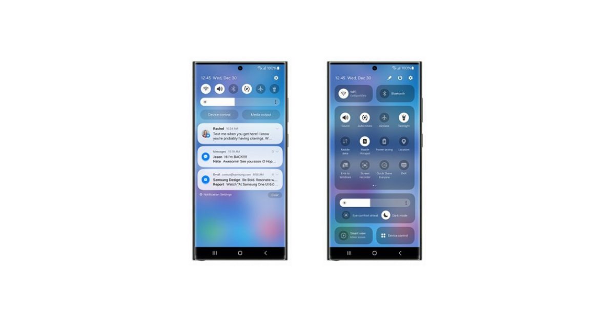
It seems like OneUI 6 is coming soon. However with the screenshots of the control centre UI, it seems like the ‘one handed’ UI focus is disappearing as more UI elements are brought higher…


I can’t stand reskins on android. Launcher you can change,but system not,without bootloader unlocks at least. The bloat is real and a bitch to get rid of and even if you adb it,you still have the overall android reskin.
Why do these companies feel the need to bloat android to such extent is beyond me.
Normally, I’d agree with you. Samsung does put some stupid bloatware apps that you have to disable (which I understand is not the same as uninstalling). But in this case I think that Samsung’s quick settings are better than stock which looks like this. The amount of space wasted there is insane.
Exactly this. Also, Samsung built a lot of functionality into the OS and did it better than Google in many cases.
I think Samsung has done an awful job on their UI. I can’t place why, I just hate it.
I think OnePlus has done really well, keeping close to stock Android but improving on it too.
Hmm. What you’ve posted isn’t far off Samsung’s shade, except for some weirdly wide buttons at the top and a media controller that doesn’t add anything to the experience.
Yes it’s got minor but not insignificant aesthetic differences, but to say Samsung’s is awful and then hold this up as an example of good design… 🤔
Here’s my Samsung’s shade in its two positions (which can be changed to open fully on the first swipe if preferred).
You can just remove those device and media control buttons from the quick panel layout.
I was referring to the weirdly wide buttons on his shade, not mine. :)
Samsung’s quick settings is okay, I should’ve clarified. I just think the rest of their UI sucks ass
Tbf this looks extremely close to Samsung’s layout but with an added widget and long buttons which are like Google’s, which I think waste space.
[This comment has been deleted by an automated system]
I used to hate Samsung’s previous design, but OneUI isn’t that bad and ads some genuinely better things than stock Android. That being said, I do miss some of the simplicity of stock, plus the genuine speed/responsiveness that it brings.
Hard disagree. From a graphic design standpoint, it is one of the most amateur interfaces I’ve come across in recent years. Their designers literally don’t understand the basics.
[This comment has been deleted by an automated system]
I like and use a lot of the added features and my phone is plenty fast enough to handle them. I don’t see the problem with this so called bloatware.
Nobody says you shouldnt be allowed to install and use the bloat yourself. But I want to be allowed to not have it on the phone. I am tech savy enough to remove a lot of it via adb but I know many people aren’t.
There’s a very vocal Samsung-hating bandwagon on every Android related community. Generally these people never used a Samsung device before or they’re Pixel fanboys and bloat is everything that’s not made by Google and just want to embrace the barebonesness of AOSP.
Those are a lot of wrong assumptions you made there.
I for one used at least 2 or 3 Samsung devices in the past and they all felt bloated,down to the fact that Samsung had both gdrive and one drive as system apps,plus their own Samsung services bloated straight into Android.
Now really,who wouldn’t call that bloat?
I don’t really view that as much different from supporting both SMB and NFS on the same device by default.
There are normal bloatware that’s totally cool like Samsung Keyboard or Galaxy Store and there are infuriating one like Facebook.
Meh, I just removed some of the pre-installed stuff I don’t need (like 4 apps) when I first got the phone and have never had to deal with anything since. If it makes the phone cheaper I’ll happily go through that effort.
Branding. Aesthetic decisions made by big companies are usually about creating brand awareness or some other corpo bullshit like that.