Testing please ignore… trying to see how it looks on mobile.
| Item | Price | # In stock |
|---|---|---|
| Juicy Apples | 1.99 | 739 |
| Bananas | 1.89 | 6 |
| Item | Price | # In stock |
|---|---|---|
| Juicy Apples | 1.99 | 7 |
| Bananas | 1.89 | 5234 |
Testing please ignore
Denied. 😝
D:
Bananas used for scale?
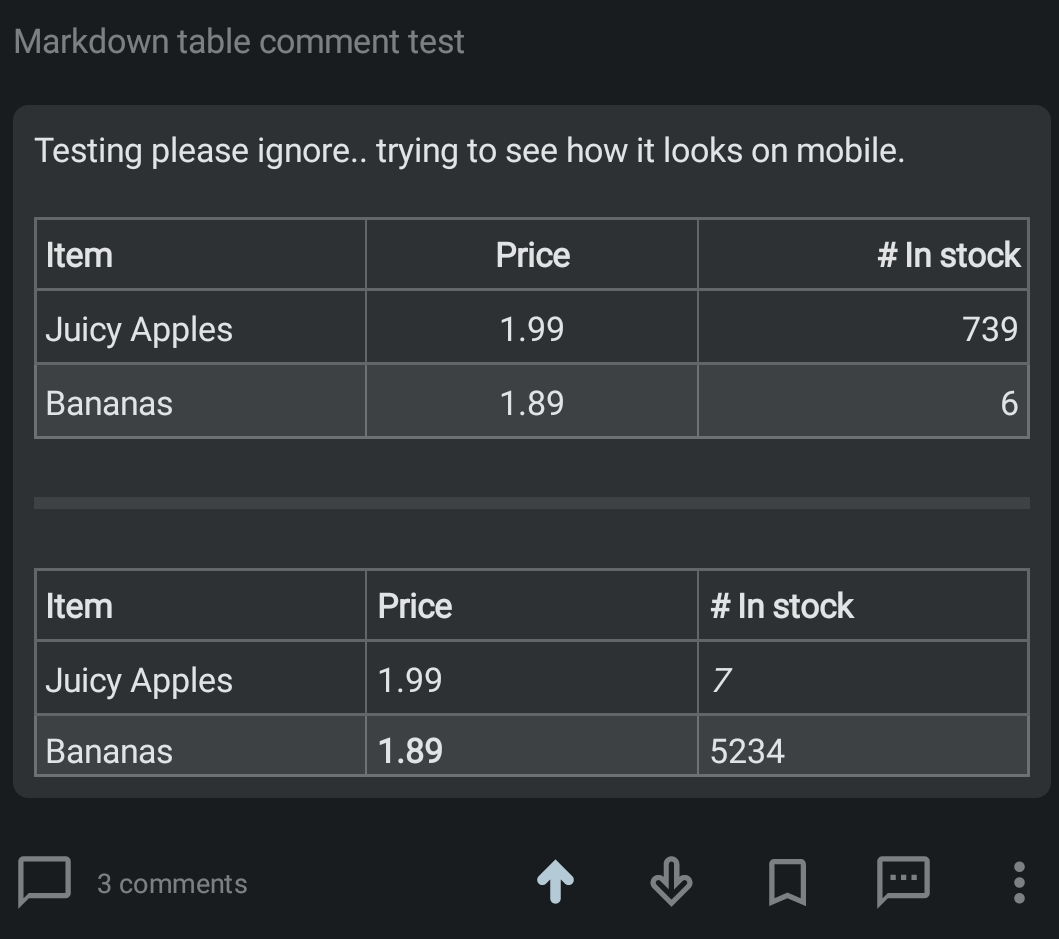
Jerboa:
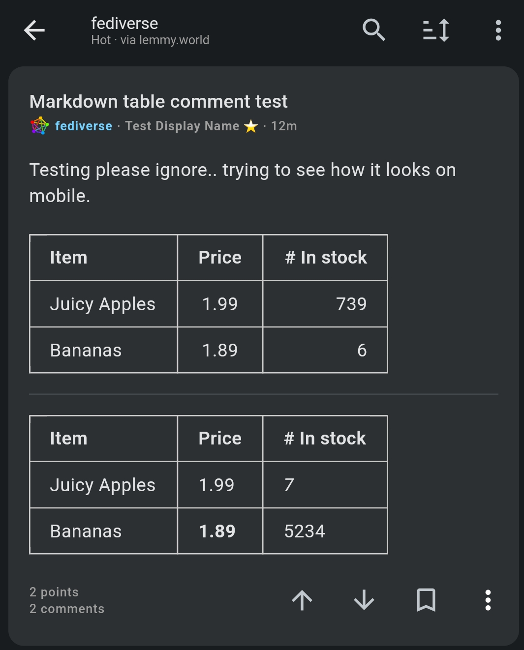
Connect:
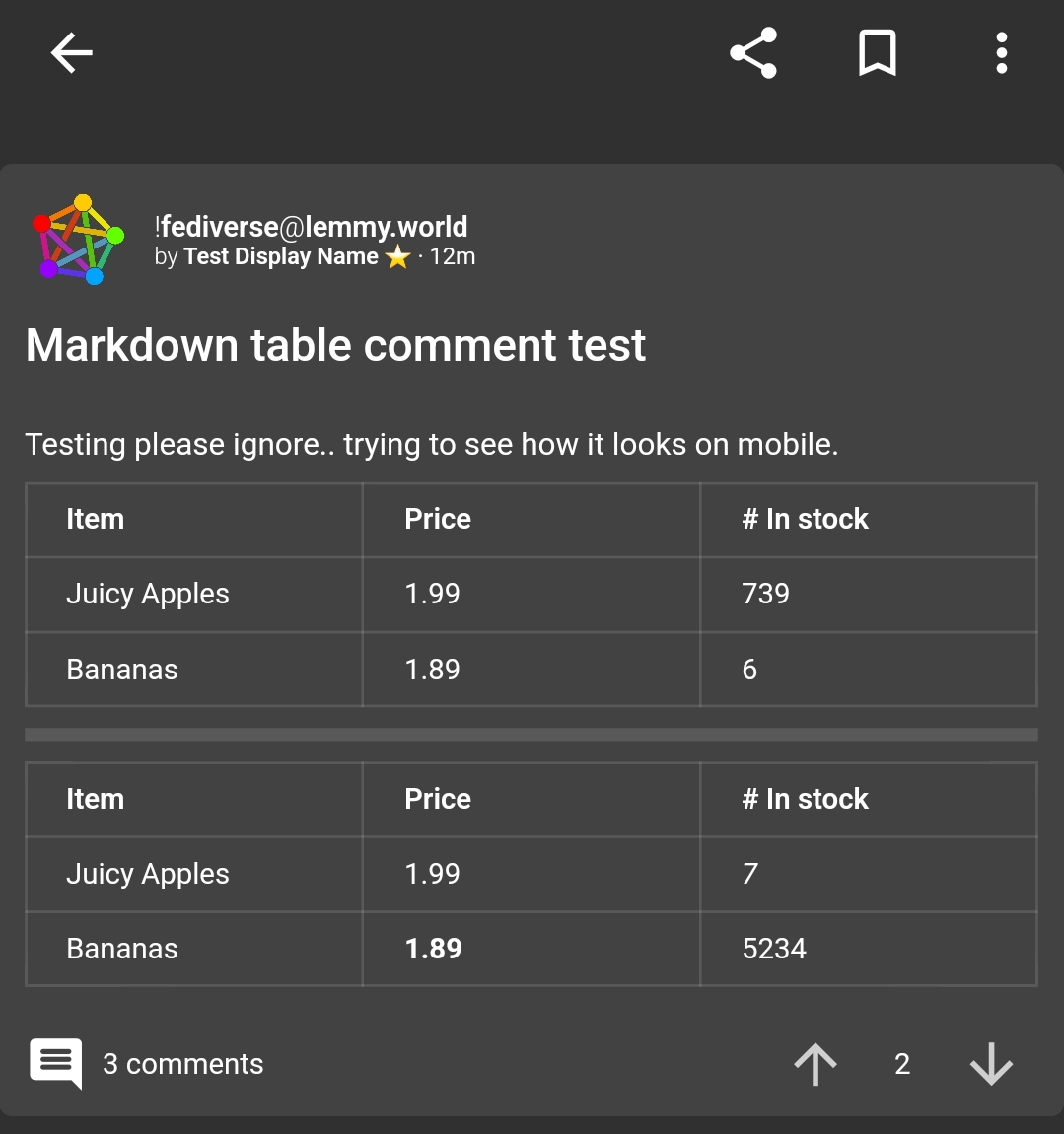
Liftoff:
Memmy:

Thunder:
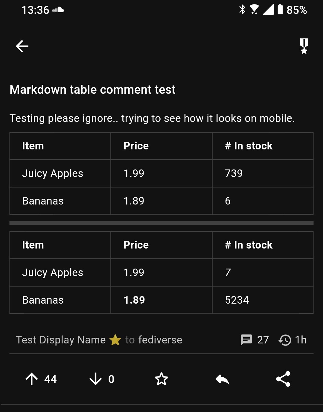
Wow it’s so purple! That’s just appearance setting right?
Lmao, that’s the theme I currently have it set at. “Moody Purple” Keep rotating through them.
This post is bananas.
Works via browser too! Very expensive apples though – they better be really juicy.
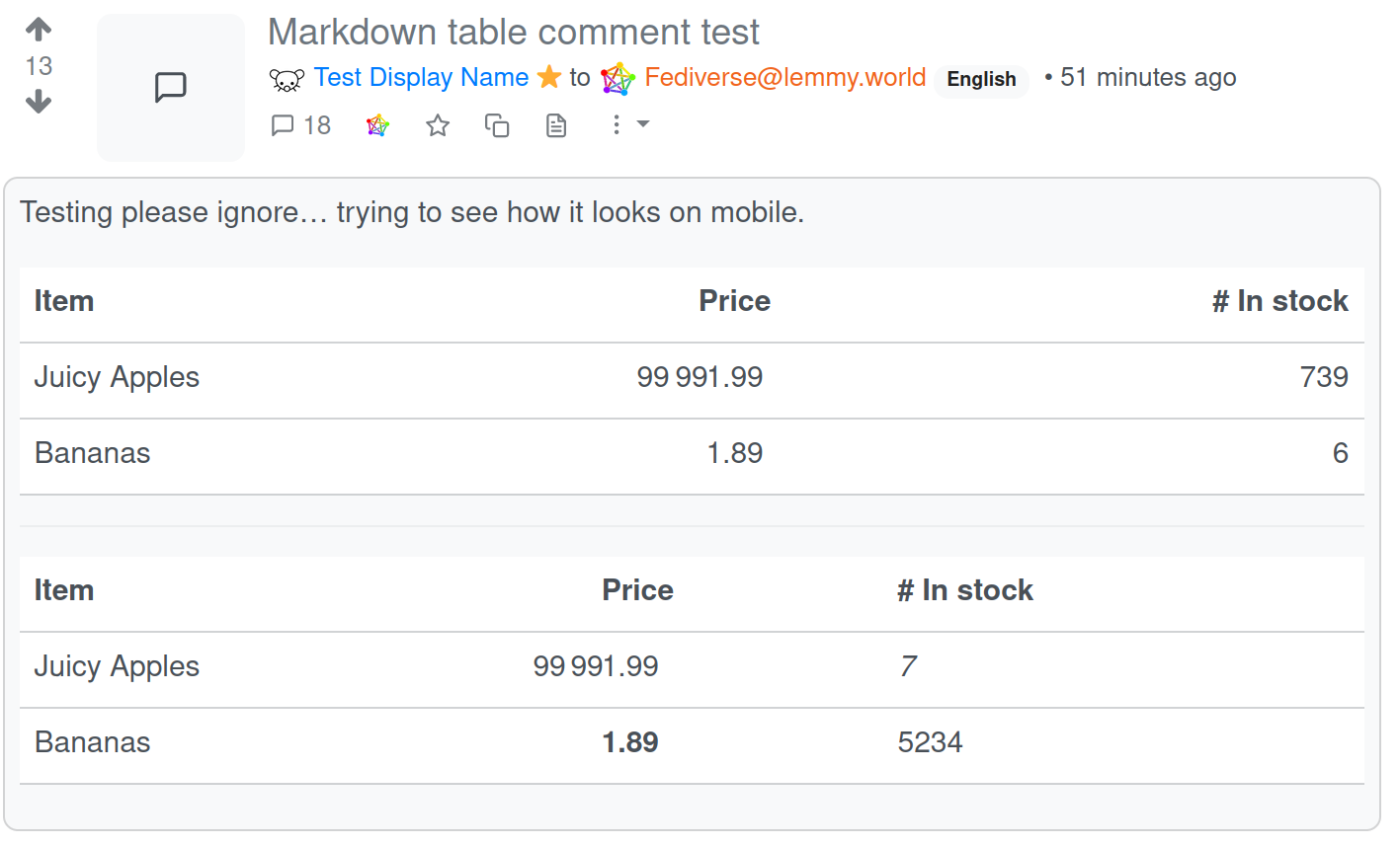
Ooh interesting, both browser and memmy don’t draw the column separators. I think I like Connect’s tables the best! 🍎
Jerboa has the column separators. Looks like it also has alternately shaded rows.
Well the screenshot I took looks really exactly like the original above. So I think browser is giving the most faithful output?
( 😂 )
Text alignment in the browser version looks messed up. The price column in the top table is supposed to be centered, and in the bottom table it is supposed to be aligned left. But it doesn’t really seem to do either correctly.
😂
Daaaamn that’s a lot of bananas !
Beware: They are the people from the math problems in your school book.
I see those juicy apples were popular
Those plane bananas must have just restocked
And those spreadsheets
You need to lower the price on those bananas dude
kbin
Unfortunately your image is somehow not visible outside of kbin
good to know. I used the image button on the kbin post dialog.
Works on wefwef.app on Firefox Android
Another Test Table abc 123 do re mi it doesnt seem to appear correctly until i click on it, at least in mlem


